
Layout blocks
A sandbox for the reusable layout blocks — Columns, Cards, Callout, Contact box, Button, Pull Quote, YouTube, Carousel, plus the WaveBand divider and this Intro lead-in. This paragraph is the Intro block; each block below has its own heading, with the WaveBand at the foot of the page.
This page is a sandbox for the reusable layout blocks. Body copy stays single-column for easy reading; these blocks are for the few places where a bit of structure helps. The copy below is placeholder, to show each block in place.
Columns
Three side-by-side points. On a phone they stack into one column.
Scope and co-design
We shape the evaluation framework together and build a shared Story of Change to work from.
Collect and embed
We gather evidence alongside the team, leaving evaluation skills behind as we go.
Reflect and share
We feed findings back as the work happens, so learning shapes it while it is still live.
Cards
A card grid, matching the “Latest Work” cards on the homepage. Each card can link somewhere.
Evaluation as an act of co-creation — not something done to people.
From framework design through to reporting and sharing the story.
Culture, place and impact evaluations with partners across the UK.
Callout
A highlighted aside for a message worth pulling out of the flow.
Contact box
A solid-magenta card that invites people to get in touch — drop it at the foot of a page where a next step helps. The sub-line is a live email link, so a tap opens a message.
Button
A magenta pill call-to-action — drop one in where a page wants a clear next step to
another page. href is where it goes; the slot is the label. An arrow shows by default.
Set arrow={false} to drop the arrow:
Pull Quote
A quotation lifted out of the flow — for a line from a participant or partner that deserves its own space. The attribution is optional.
Add a subheading. Lorem ipsum estat quali opeor rt morem ickbat estat losum mora quot aquaq.
Without an attribution the card still renders — just the quote:
Mostly after action learning, I feel an enormous sense of joy and gratitude, and massive relief, that you have unburdened something you did not even know you were carrying.
YouTube
An embedded, accessible video player for a single YouTube video — a proper player instead
of a “watch the video” link. id is the bare video ID (the bit after watch?v= or
youtu.be/ in the address); title is required and labels the player for screen readers.
To start part-way through, add start — a plain number of seconds from the beginning. So
start={90} opens the same video at 1:30:
Carousel
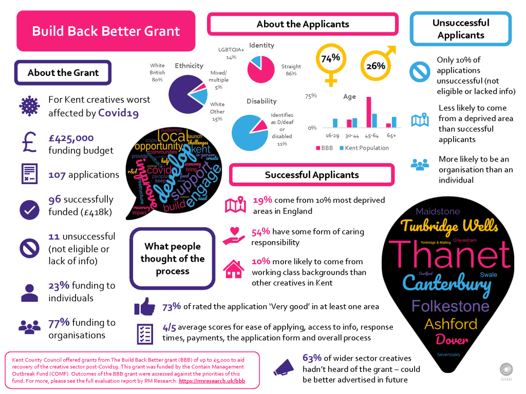
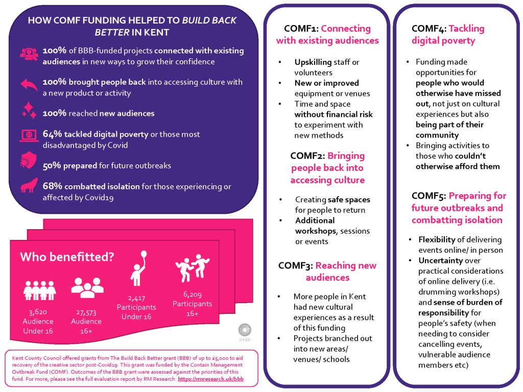
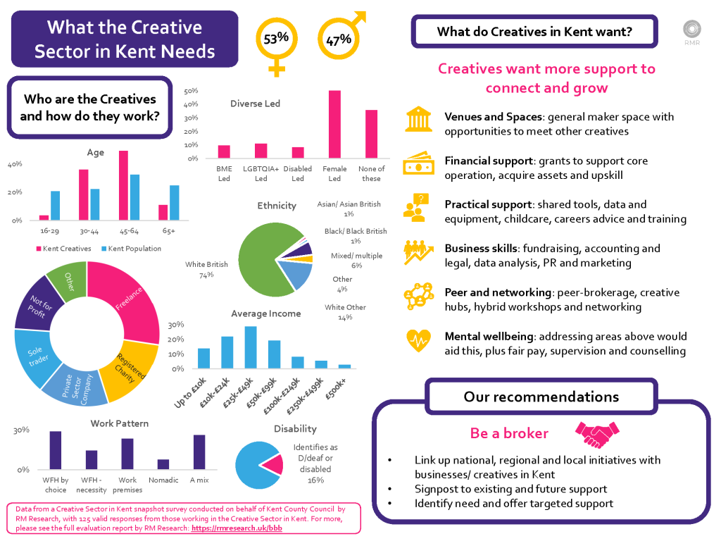
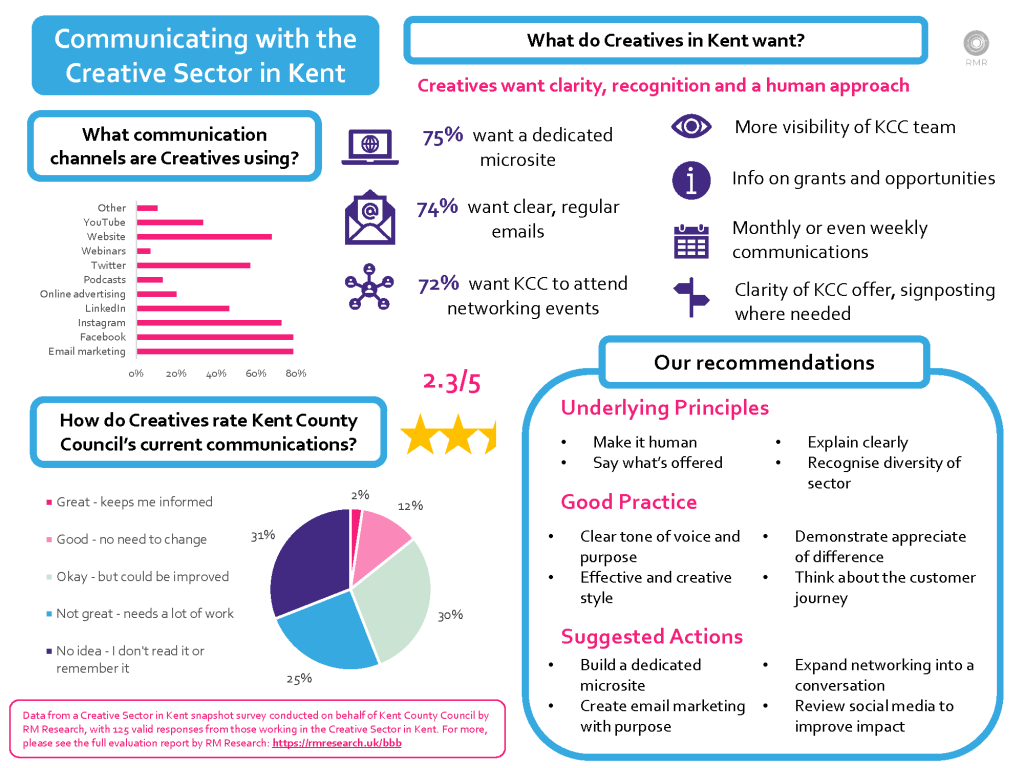
A caption-led image slider for a run of photos or infographics — one image at a time,
with arrows, dots and a short caption under each. Name the images by filename prefix
(every /files/images/<prefix>* file is picked up, in filename order) and give a caption
per slide. ratio sets the frame shape so the page never jumps between slides.
WaveBand
The pink wavy divider that breaks up a page, as on the homepage between the overview and Latest Work. It spans the full width and takes no props — drop it in wherever a section break wants the stripe.
Spacer
A deliberate vertical gap for the few places where the default paragraph spacing is not
enough — most often around an image. It takes a size of sm, md (the default) or
lg, and adds space and nothing visible. The grey rules below just mark each gap so you
can see it; on a real page there is only the space.
The line below sits above a small gap:
…a medium gap (<Spacer /> or <Spacer size="md" />):
…and a large gap (<Spacer size="lg" />), e.g. after a full-width image: